Colours come and go, but red – whether lipstick, carnation, oxblood or apple – can transform a space like no other.
“Red is said to evoke emotions, grab attention and make a statement, so it’s no wonder it’s the colour most commonly used to signal danger,” says designer Matt Woods from Killing Matt Woods.
“Use red if you want to create a bold and striking look. When I use red it adds depth, energy and an edge.”
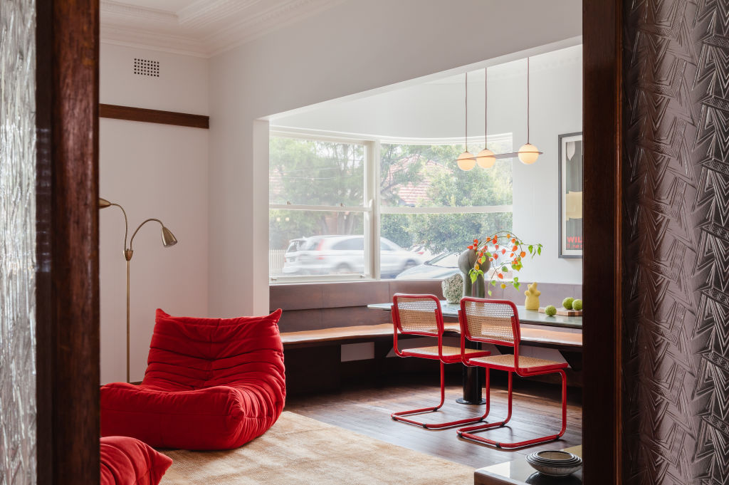
Red has experienced a resurgence thanks to the ‘unexpected red theory’. Photo: Kat Lu | Design by Killing Matt Woods
Red has recently experienced a resurgence thanks to the “unexpected red theory”, a trend conceived by Brooklyn-based interior designer Taylor Migliazzo Simon that has clocked over 17.3 million views on TikTok.
Described as “adding anything that’s red, big or small, to a room where it doesn’t match at all”, with the result that it “automatically looks better” has inspired many to re-embrace this fiery hue.“I grew up in a terracotta bedroom with a deep orange carpet, which may have influenced my love of red,” says K.P.D.O. designer Kerry Phelan.
“I have loved red for over 20 years and am driven by it through what I see in fashion and books of the 1950s and ’60s. It’s a vibe we reinterpret and make new again.”
Designer Kerry Phelan says selecting the right shade is essential. Photo: Sharyn Cairns
“Red is joyous and should feel sunny and uplifting and be used with integrity,” she says. “I gravitate towards orange-red rather than blue-red. It gives light, whereas blue-red absorbs it and can look gloomy.”
Darker shades of red are often applied to create a warm and cosy atmosphere, while brighter shades add vibrancy and energy.
“I prefer warm, earthy tones and terracotta colours,” Woods says. “The inherent tonal variations in natural products, ranging from orange-red to peach-pink and brown to grey, are what I find most satisfying in executing a colour scheme.”
Red can add depth, energy and an edge, says Woods. Photo: Kat Lu
Changing light can affect the appearance of a colour.
“By night, red appears moody; by day, it is lighter and throws shadows,” Phelan says. “Always consider a space’s natural light source, as well as artificial light that adds yet another dimension.”
While the “unexpected red theory” believes red isn’t required to “match at all”, the experts disagree. Red is a strong colour in its own right but also makes an impact when combined with the right hues.
“Either complement or contrast your red,” suggests Woods, who recommends neutrals, such as cream, blush, coffee and biscuit, as a calming base for most shades of reds, and cooler tones and shades of blue and green for a striking contrast.
Changing light can affect the appearance of a colour. Photo: Derek Sewell | Deco House by KPDO
If using an orange-red, Phelan suggests mixing it with pale creams, caramels, chalky whites, charcoals, black, silver, polished brass and stainless steel.
“Caramel velvets, black-and-white printed fabrics, travertine, walnut and caramel timber are also fabulous with orange-red,” she says.
Red creates a talking point no matter how it is applied.
Paint an entire room red to create a strong, clean aesthetic. As the space is drenched with colour, there are no colour contrasts, so it feels calm, serene and spacious, especially if it has high ceilings.
“Red brings drama and power to a space,” says Bronwyn Riedel of BAUWERK Colour, who has a penchant for warm and dirty reds. “Use it sparingly or overdo it totally – it should be one or the other.”
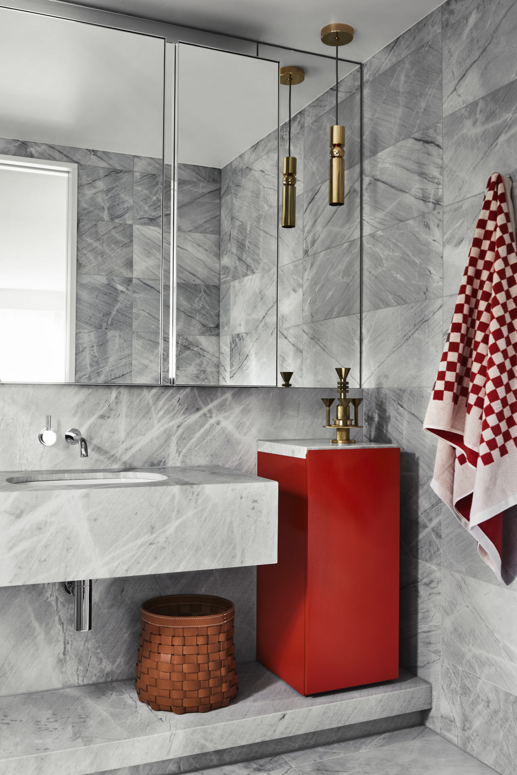
Phelan says a home’s theatrical spaces, like the powder room, are the perfect places to go red.
“Small rooms look spacious when painted red – high ceilings are important in this instance, as are walnut, caramel or mahogany timber floors,” she says. “A passageway or circulation space that takes you from one room to another is also gorgeous in red.”
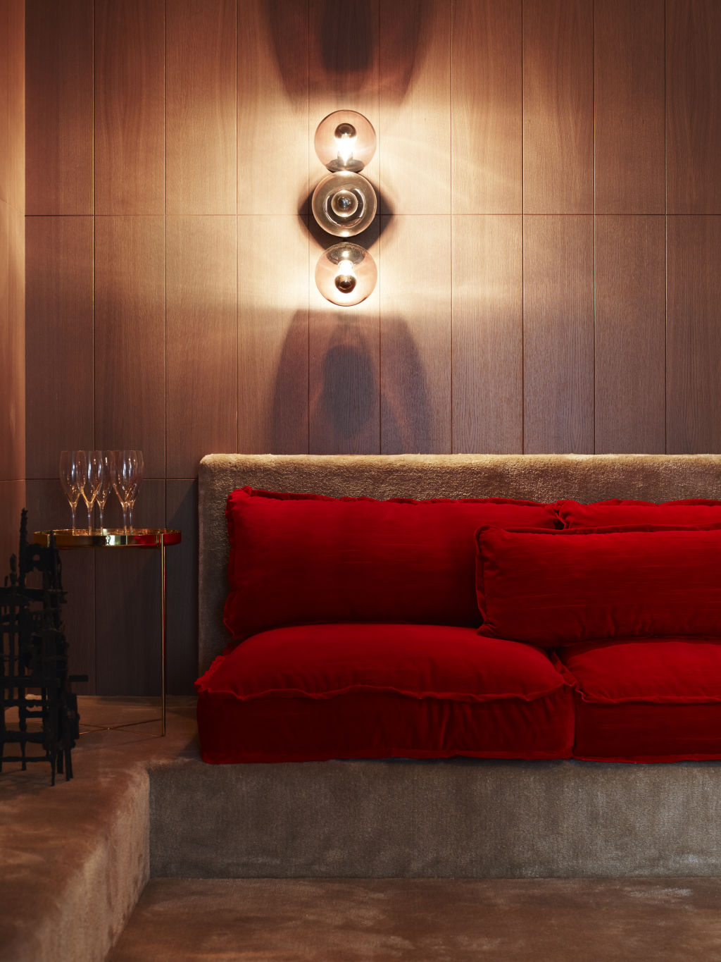
Red accessories can be used to elevate a room. Photo: Tim Kaye | Art House by KPDO
If an all-red room feels too bold, try an ombre effect.
Choose two shades of red and paint the lighter shade first. Then, where the darker red meets the lighter one, gently blend on the overlap using a brush loaded with the bolder shade.
Woods also suggests starting small and working your way up.
“Once you’re comfortable, gradually increase red’s presence,” he says. “As confidence comes with experience, give yourself time to experiment and find what works for you.”
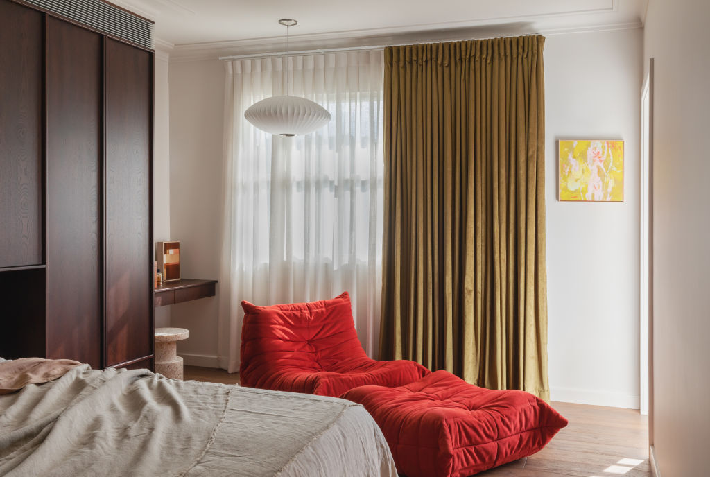
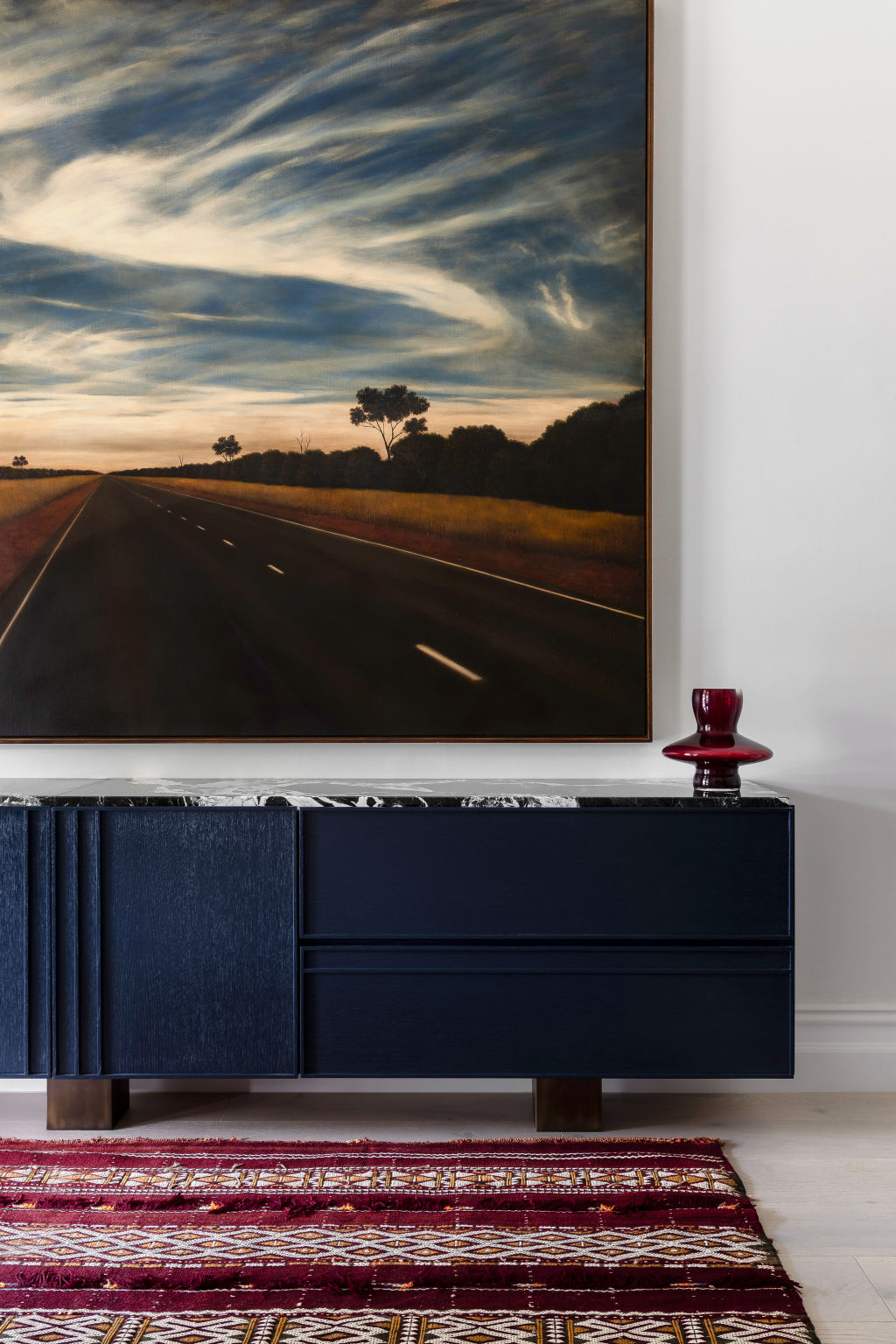
Choose red to highlight an interesting architectural feature, elevate a room using accessories like a red cushion, throw or lampshade, or paint a single element, like a dresser or door.
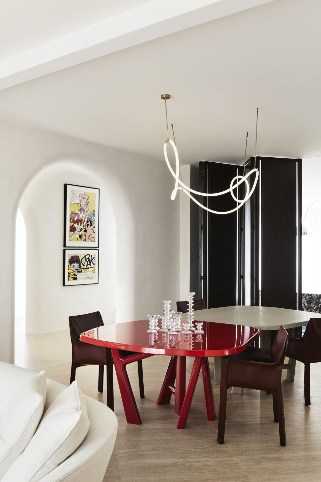
Red can be joyous and uplifting. Photo: Sharyn Cairns Photography | Toorak House by KPDO
“Red provides a different effect when it is velvet, leather, 2pac or painted timber,” Phelan says. “Glossy and matte reds add different depths to a space.”
If you have a large piece of furniture, floor rug or artwork in a neutral space, make that your red statement piece.
“Art even looks great on a red wall – it throws it into relief,” she says. “A red artwork on a red wall hums with a sense of mystery.”
At a time when we crave joy, vitality and optimism in our homes, red feels just right. As the “unexpected red theory” tells us, you can’t go wrong with red.
Whether you’re planning a total overhaul or making subtle changes, bathroom renovations can add significant value to a home. With Domain’s step-by-step bathroom renovation guide, you can take the stress out of the process. Our comprehensive guide will provide an overview, with sections diving deeper into the specific aspects of … Read more
Summer is here, and as we emerge from our Queenslanders, bungalows, townhouses and apartments, our focus shifts to prepping outdoors ready for relaxation and entertaining. “Australians love to connect with nature – it’s food for our souls,” says designer Lynne Bradley. “We are known for our love of barbecues and turning … Read more