As a counterpoint to the explosion of colour we are seeing in design now, classic beige is bravely emerging, proving the enduring appeal of a natural, monochromatic palette.
“Beige is the quiet achiever of interiors – it never shouts for attention, but grounds everything around it,” says Melbourne interior designer Alison Lewis.
“Beige is timeless because it works in any style, from a modern renovation to a character home and adapts beautifully to changing trends. When used thoughtfully, beige has a warmth and softness that feels calming and enduring.”
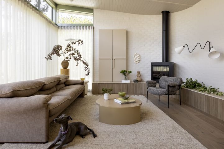
Beige, when used thoughtfully, can lead to calming interiors with a timeless feel. Photo: Dylan James
While beige is often associated with minimalist design, its true strength lies in versatility – effortlessly complementing styles from mid-century classics and maximalist 1980s interiors to today’s sweeping contemporary curves.
“Beige is moving away from the sterile minimalism of the past and into a much more layered, textural and lived-in aesthetic,” says Lewis. “It’s less about stripping things back and more about adding warmth, comfort and tactility.”
For a home in Bondi by interior designer Shona McElroy from SMAC Studio, beige served as a soft backdrop for design-led furnishings as well as soft and bright colour accents.
Versatile and classic, it’s no wonder beige is a hue we can’t quite let go of. Photo: Dylan James
“Beige provides a layered approach, becoming almost a sepia background for the space, and additional colours provide a nice layering effect, giving beige an eclectic feel,” says McElroy, who teamed it with bright yellow, deep green, shades of pink and red and dramatic purple.
“You can layer lovely, muted colours over beige and create a beautifully considered palette. Try leaning into blues for a Nancy Meyers aesthetic or make it contemporary by drenching a space – walls, ceilings, skirtings, architraves, cornice – match them all!” she says.
Pair beige with muted blue for a Nancy Meyers aesthetic. Photo: Dave Wheeler
For Lewis, beige is at home with almost any colour on the wheel.
“In a maximalist space with bold patterns or saturated colour, beige balances and calms the eye and gives louder elements room to breathe,” she says. “Don’t be afraid to push into the deeper end of the spectrum, camel, mocha, even muddy olives as all of these tones keep beige interesting.”
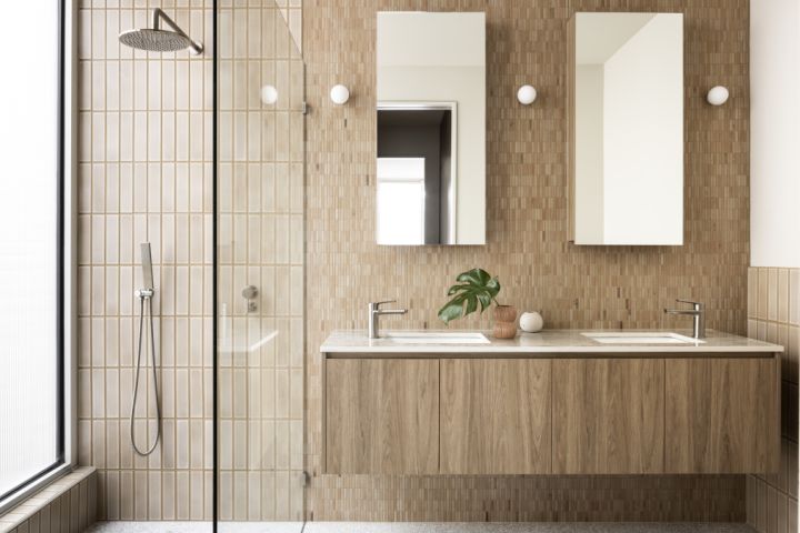
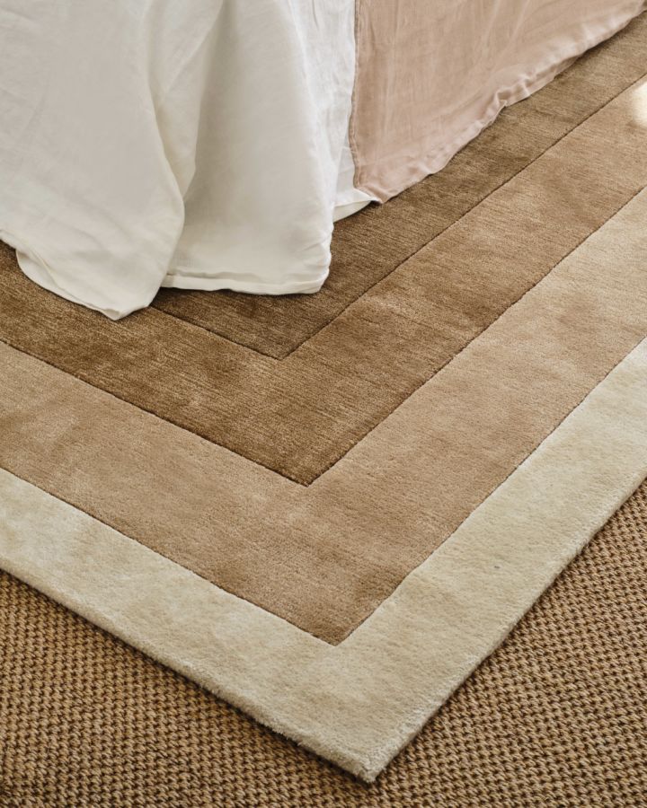
Tactile textures can help make beige a little more interesting. Photo: Dylan James
Banish beige’s reputation as “blah and boring”, by bringing it to life with textures such as stone, timber, linen, wool, Venetian plaster, chrome and stainless steel.
“Beige on beige can easily fall flat if there’s no variation,” agrees Lewis, who paired it with timbers, brickwork, softly veined stone and tactile fabrics in her Hartley House project. “Materiality is what gives beige dimension.”
Lighting, whether natural or ambient, is essential when it comes to elevating beige, as the amount of light a room receives will impact how it appears in that space.
Lean into camel, mocha and muddy olive for more depth within the beige palette. Photo: Dave Wheeler
“Natural light brightens beige walls, but because they’re still warm, amplifies the feel of sunlight in that space,” McElroy says. “If your space doesn’t receive much natural light, use warm white uplights or wall wash lights to achieve a lovely shadow play similar to a sunbeam.”
Equally important for beige is an indoor-outdoor connection with lush greenery, which provides it with a beautiful, rich backdrop.
Green and beige are best friends: even in nature, they’re often seen together. Photo: Leif Prenzlau
“Green and beige are best friends – it’s that natural pairing we see in landscapes every day,” agrees Lewis.
“Greenery sharpens and freshens beige, while beige allows green to really pop. For our Rathmines project, the connection to the outdoors brought beige to life, allowing it to become a canvas that echoes the tones of the garden beyond.”
McElroy says the biggest mistake people make when applying beige is pairing it with white.
Pops of colour shine even brighter next to ‘boring’ beige. Photo: Dave Wheeler.
“Beige can be a little jarring for those who grew up with China white walls, yellow travertine floors and white ceilings and skirtings,” she says.
“White brings out beige’s yellowness, instantly ageing it. Avoid doing one room beige and leaving the rest of the home white and always look for a warmer tone of white that beautifully complements beige. To keep it modern, avoid white trims and ceilings and instead match the ceilings with the walls.”
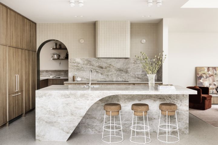
Beige is still considered a ‘superhero base colour’ by many in the design world. Photo: Dylan James
Endlessly versatile and beautifully timeless, beige breathes new life into a space while providing the opportunity to play with colour, textures and materials.
“For me, beige isn’t boring,” says Lewis. “It’s the superhero base colour that works in all environments and when you layer it with texture and grounding depths, it transforms into something quietly powerful and full of life.”
Interest rate cuts now unlikely before second half 2026 as services inflation proves stubborn. Rents, utilities and insurance continue rising, limiting RBA easing despite broader economic slowdown and household spending weakness. Expectations of interest rate relief in 2026 are becoming less likely as inflation continues to show signs of persistence. … Read more
Here’s what designers are changing in their work and practices for 2026. New year resolutions typically fall into two categories: the small but impactful daily tweaks like swapping that 3pm coffee for green tea, and the grand life milestones like getting the keys to your first home. But for … Read more