We’re not kidding when we say that art can make or break a room. So, when you’re styling your home it needs to be carefully planned and not just an afterthought. Easier said than done, you say?
With so many options, sizes, styles, colours, frames and price points to navigate it’s no wonder so many people feel out of their depth when buying art for their home. It’s definitely one of the more challenging things you’ll tackle when styling your home but we promise it doesn’t have to be.
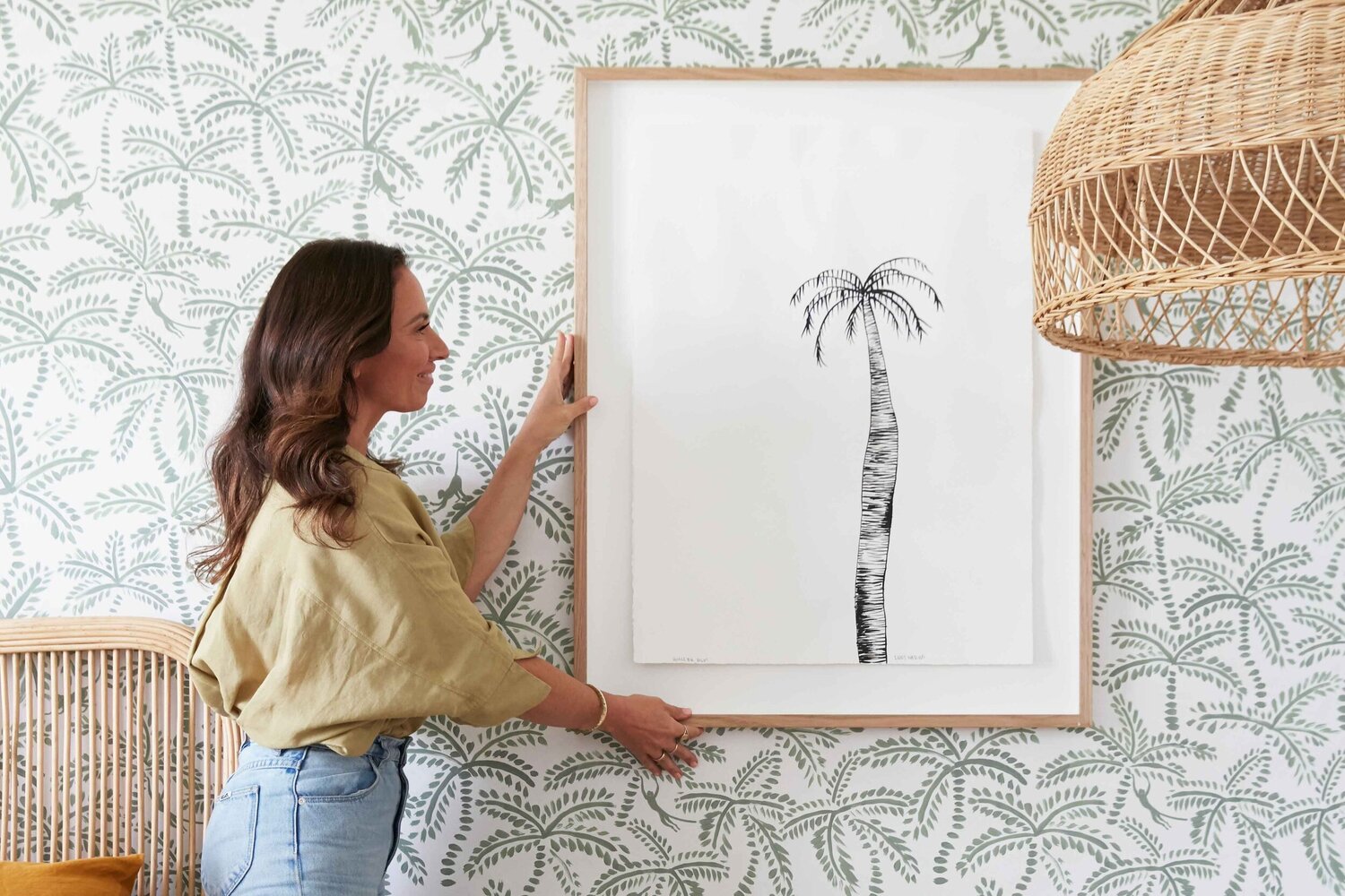
SO, WHAT IS WALL ART?
Art is much broader than just paintings, prints, canvases and framed photos. There’s no reason why so many more items can’t make marvellous art pieces for your walls too, like; pretty hooks, mirrors, surfboards & skateboards, painted tiles and neon signs. Do you get the gist? Don’t be afraid to expand your mind to the possibilities of wall art.
START WITH COLOUR
Colour plays a massive role when styling a space. And when it comes to choosing art, colour is the best place to start – it’s the leading lady and the fundamental element you need to get right when choosing art.
Art is an opportunity to add interest and diversity to a space… but we’re not saying you should completely ignore your vision board – we would NEVER say that – we’re just saying that it’s more important that the colour palette of your art works in the room. If you want to create a contradiction and introduce a little quirkiness, you may actually choose to have a very different style of art in the room. That can totally work as long as the colours tie in with your overall colour scheme for that room.
For example, take the art we chose in the formal lounge room below. Just because our vision board screamed Hamptons style, that doesn’t mean the artwork in this home should only depict coastlines, boat anchors, lobsters and Adirondack chairs. #toopredictable
We wanted to give this Hamptons-inspired lounge a young, quirky edge, so chose a print that is definitely not what you’d call traditional Hamptons (heck, there’s even a nipple on show if you look closely). But the blue colours and pops of gold in the print tie in with the colour scheme in the room really well. So it works!
BLEND OR POP?
When thinking about the colours in your art, you need to ask yourself if you want them to complement or contrast the rest of the room. Put another way, do you want your artwork to blend in or pop?
Both can work, it just depends on what else you have going on in the room and how much of a focal point you want the artwork to be. Obviously, something that pops off the wall will be more of a focal point than one which casually blends in.
PERSONAL TASTE
Your personal taste is definitely a consideration, but it’s not the only consideration. Honestly, getting the colour right is more important than personal taste. But you can totally have your cake and eat it too. If you find a piece of art you adore, then you can build your room’s colour scheme around that piece.
What we wouldn’t recommend, is buying a piece of art you adore, but that does not work with the colour scheme of your room. That’s when personal preference is not helpful or a wise investment. Equally, if you find a piece of art that is the right colour (tick) and style (tick) but you really don’t like it and it doesn’t make you feel good, don’t even think about putting that up on your wall. Now’s a good time to channel your inner Marie Kondo and ask “does it spark joy?” If your answer is “no”, it’s not the piece for your home. You have to like the art. #followyourart
WHICH WALLS NEED ART?
Please do not put art on every wall. That just doesn’t make sense.
The elements and principles of design will help you resolve the styling dilemma of where to put art. Windows and doors might limit your options, so this might be an easy decision. But if not, you’ll need to do a bit more thinking. First, you’ll need to decide whether you want your art to be the focal point. If so, it should be hung on the wall you see first when you walk into the room.
Creating a focal point is a key part of styling. The empty (or negative) space in a room is just as important as the filled space. If you have too many things on too many walls, all competing for your attention, your brain won’t know where to look and the ‘wow’ moment that could have been will be lost. Instead, look to create balance. Our tip would be to start with a ‘less is more’ approach. Choose your moment – and go for it. You can always add pieces to other walls down the track if they feel a bit naked.
Top Tip – If you have an open-plan space and can see lots of walls from adjoining rooms, try using different types of art on the walls. For example, you might hang a large print on one wall and a mirror and sculptural piece on another. This variety will tie them all together better than hanging three pieces of framed art will.


