Life BC – before COVID – was a less colourful time, when our love of clinical whites, greys and Hamptons neutrals helped maximise the resale price of our homes.
Now that house prices have boomed, designers and colour experts say Australians will increasingly bring more colour into their homes to spark joy and a greater connection to nature.
“We are on the cusp of transformation, with increasing political and economic change,” says Kmart’s head of design, forecast and product technology, Anne-Marie Bodal.
“Brighter colours, patterns and artistry are coming back. We are going through a huge flip of how we use our homes and behave in them.”
The new mix of palettes from Kmart include calming and soft pastels. Photo: Supplied
Australian Trend Forecast founder Kim Chadwick says it’s been a “pretty dull decade for colour” in the past 10 years but a new mix of palettes are making their way into our living, eating – and, increasingly, working – spaces.
“There is a mix of new colours coming through, ranging from soft and calming colours to the reassuring colours of nature,” she says.
Trend forecasters are predicting Australians will begin to fill their homes with these four chromatic colour combos:
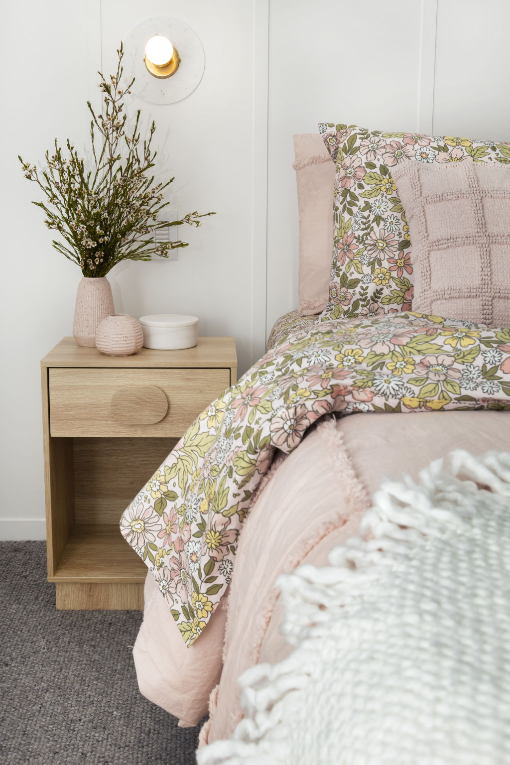
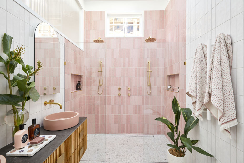
Blush pink and dusty blue
The Block 2020: Jimmy and Tam’s en suite. Photo: Channel Nine
If you’ve watched The Block on television, you’ll notice calming pastels have arrived in bathrooms, just as they did in the 1950s and 1960s.
“Nude concrete and blush pink and blue in the bathroom is popular,” says Chadwick, who predicts these modern pastels will grow in line with bigger trends like Scandinavian and mid-century modern.
“Dusty blue is about security and safety, which is why you usually see these tones in babywear,” says Bodal. “Blue is a great colour that makes you focus – it makes your mind feel clear.”
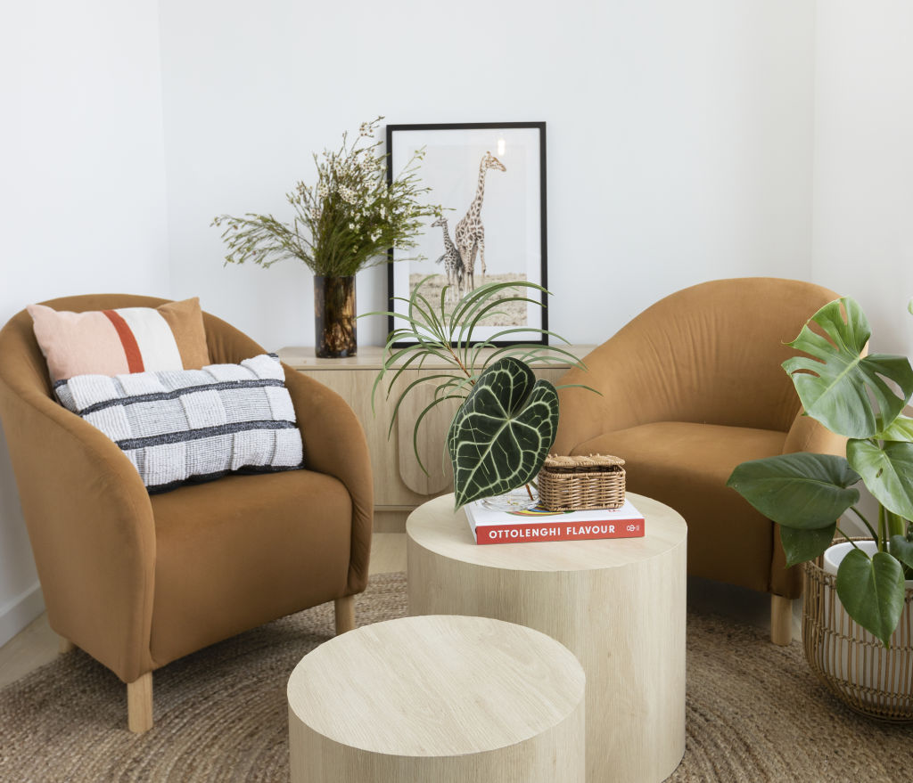
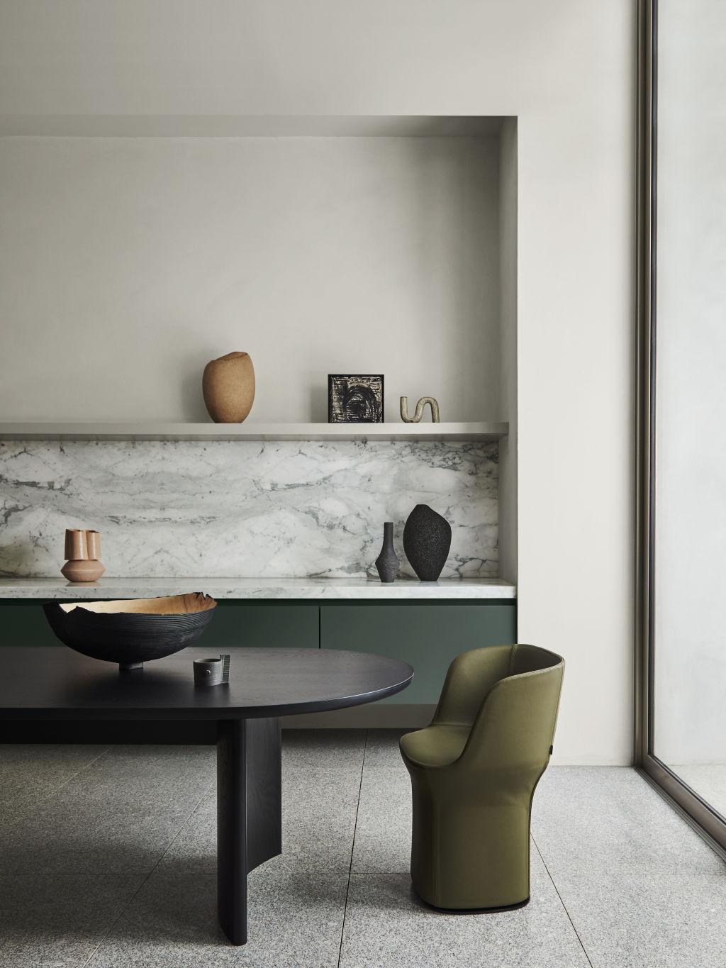
Terracotta and olive green
The terracotta and green trend will loom large in our homes. Photo: Kmart
Bodal says Australians have always blended indoor and outdoor living in a unique way that doesn’t happen in Europe or America, and predicts that the terracotta and green trend will loom large in our southern-hemisphere homes.
“Terracotta reflects the clay and the colour of the earth and we love bringing greens inside, especially if you’re in a house that doesn’t have good access to the outdoors,” she says.
Chadwick says the earthy colours work well with misted greys and are an extension of the indoor plant trend.
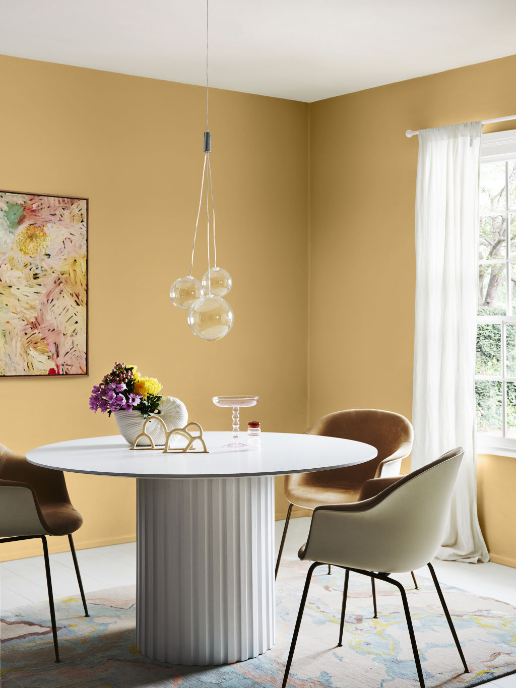
Soft grey and lemon yellow
Australians are gravitating towards optimistic yellow while stuck at home. Dulux’s Wonder palette. Photo: Lisa Cohen. Styling: Bree Leech
Pantone named grey and yellow as the colour combination of 2021, but stylist Heather Nette King says Australians have been gravitating towards optimistic yellow for a while now.
“People are making more bold choices now they are stuck at home and seeing their living space as more than just a commodity,” she says.
Katrina Hill Design Group founder Katrina Hill – who studied colour psychology in London – says COVID has inspired people to be more adventurous with colour, but in new and strange ways.
“I’ve seen one forecast showing a turquoise blue in just one corner of a room to about [a metre] high – dado rail height – as a place for where children can sit on the floor and be quiet,” she says. “The rest of the room was a different colour.”
Hill says people will increasingly use colour to create “pockets of sanctuary” while mixing it up with texture from snuggly throws, cushions and rugs.
Chocolate brown and sage green
The Dulux 2022 colour forecast uses chocolate brown and earthy green in its Restore palette. Photo: Lisa Cohen. Styling: Bree Leech
Chadwick says this colour combination of chocolate browns and earthy greens is about a deep need to connect with Mother Earth.
“We are hoping she will rescue us, ground us and honour keeping us alive,” she says. “These colours are reassuring and reminiscent of forest bathing, which is another huge trend.”
The Dulux 2022 colour forecast uses these colours in its Restore palette and says these colours “provide the reassuring backdrop which allows us to readjust to constant change”.
Hill says the one thing we will all need to change if we want more colour in the home is our lighting.
“Those cool white LED globes you buy at the supermarket are everywhere – it’s the St Vincent’s emergency room look, which does no good for nurturing,” she says.
“If you want colour to look good in your home, you need to use warm whites and not go over 3000 kelvins. Get your globes from a lighting store instead.”
The 2019-2020 Black Summer bushfires impacted Mallacoota severely, but house prices recovered within years. Other disaster-affected communities haven’t bounced back the same way. The difference isn’t just about the disaster itself. Natural disasters can lead to very different property market outcomes. Some locations recover and go on to perform strongly, … Read more
The anti-minimalism look celebrates untidiness but can take a turn for the worst in the wrong hands. Have you heard about the latest interior trend? Cluttercore. Essentially it’s an anti-minimalism look that, well, celebrates untidiness. On a good day, the style is a wonderful mash up of things … Read more